This is a great list of complex words with clearer alternatives. It was put together by Deanna Horton, a content designer currently at Shopify. I'm actually working on a similar list as a permanent resource on Clear Language Club.
It sounds silly, but just looking at a complex word alongside a more everyday alternative is a great way to understand plain language. Examples make it easier to see the difference. Classic show rather than tell.
A few years ago, Gather Content asked me to write an article for them that outlined some of the principles of plain English. In general, I always think it's a good idea to start with principles when you're learning something new. Get the essentials down and then go from there.
Anyway, the piece proved popular and you can still read it online today – hooray for the internet! Quick disclaimer – Gather Content got bought out by Bynder and they have added a few images and maybe made some changes to the copy.
Some of it looks very unfamiliar, but most of it is mine!
If you are just stopping by, you might notice things have started to look a little different around here. I’m getting ready to launch the blog (to go with the newsletter) and this is an official test post to make sure it all works.
While you are here, you can check out a few new pages. There is an about page you can read, an RSS feed you can subscribe to and a changelog that tells you what’s new.
The plan is to publish a few posts and then send a newsletter out to everyone next week. Oh – you can also follow the new Clear Language Club account on Bluesky. New posts will go there too when they are published.
I have some news to share. Two pieces of news actually.
First, if all goes to plan, the next time you hear from me it will be to tell you that the companion website to this newsletter has become a blog. And no ordinary blog, because it will contain original posts alongside what I think we still call link posts.
Basically, if you enjoy the format of this newsletter – links to great content about content with some commentary and context from me – then you will also enjoy the blog. I'll explain more when it's all live.
Second update for you: another name change. On LinkedIn, I asked folk to help me choose a name for the site when it becomes a blog and a newsletter. The responses were super helpful. Feel free to go and add your own thoughts too.
But the current plan is to switch from Plain English Club to Clear Language Club. There are a few reasons, but the important ones will become clear (clear!) if you read the first article in the list of links below.
That's it for now. Thanks for subscribing. More soon.
I did not know a lot of the history outlined in this post by Caroline Jarrett until she kindly pointed me to it last year. Historical drama aside, I think the key distinction for me is the importance of testing content with users.
Plain language relies on testing with users. If the intended users can use the content to do what they need to do, it’s plain. If they can’t, it’s not plain. So you can only really know whether you have succeeded in writing in plain language when you have tested with the actual users.
And of course, this detail is fundamental to content design as a discipline. It's about following the principles of clear writing, but making decisions based on research and data. You need to understand what users need before you start writing. Then you need to test your content when you're done to make sure it meets those needs. It's only plain or clear if it does.
This is a brilliant piece of work by the team at Scope. And of course, almost all of this guidance can be put into action for any user research, not just when its done specifically with disabled people and their families.
This post on LinkedIn by Vitaly Friedman, editor-in-chief of Smashing Magazine, is not specifically about content, but it's full of useful, related information. This includes some statistics, infographics and a collection of simple, practical tips.
When we start working on an end-to-end service, we define the users, then map out the journey. This process shows us what tasks users need to complete and highlights where the content doesn’t help them to do this.
What follows is pretty much a step-by-step to get you started. Of course, you'll need to take your organisation's specific circumstances and constraints into account. But hopefully it should be easy to get the right people together and start mapping those content journeys. Also, you can do all this at the start of a content project, not just when things already exist and are ready for an update.
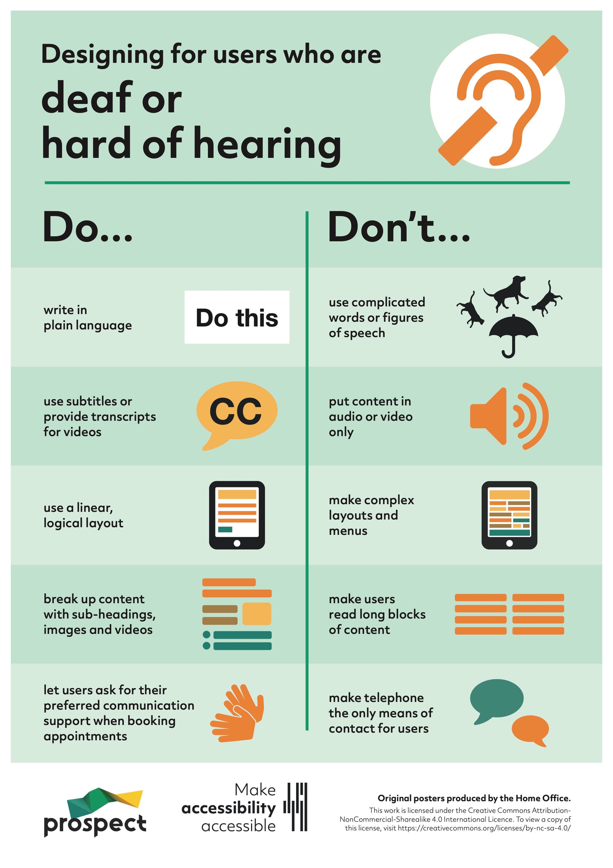
Probably the biggest misconception around screen readers is that they are only used by people who are blind. This is far from reality. WebAIM's latest Screen Reader User Survey shows that only 77% of respondents identified as being blind.
"Accessibility never happens by accident. There must be a deliberate effort to make products and services more accessible. It doesn’t have to be challenging if it’s considered early. No digital product is neutral. Accessibility is a deliberate decision, and a commitment. Not only does it help everyone; it also shows what a company believes in and values." Vitaly Friedman
Join the club
Join a growing community of 950+ plain language champs and start getting advice and resources that help you write clearer, more accessible content.
You may be getting ready for a well-earned rest, but don't let that stop you enjoying this latest edition of the Plain English Club newsletter.
All being well, I'll be able to send you another email full of goodies before the year is out. And you never know, in the new year there may be a little update to the website and how that works.
Over the past few months, my team and I have spent time gathering feedback from UX writers and content designers from around the industry. Between feature requests and copy recommendations, one theme kept bubbling up: Figma is pretty intimidating for writers. If you can relate, don’t worry—you’re in good company. Many of us, including the writers here at Figma, come from fields beyond design, and never learned to use design tools. With so many bells and whistles, where do you even start?
The answer, of course, is with this guidance. And it is indeed a very useful starting point if you are new to Figma or working with other disciplines on content.
I would add, if you take the time to learn Figma in more detail, you can easily put together your own prototypes. You can use those prototypes to quickly test your content ideas or explain them to your teammates.
Naming services is an important part of digital transformation. Service names need to be clear, concise and related to the task people are completing. But this can become harder when the situation becomes more complex.
The thrust of the post is about using dedicated workshops to get all the key people together:
An engaging naming workshop is a way of making sure that everyone has the same level of knowledge of what’s involved in this task, and the importance of it. Getting important stakeholders involved and as close as possible to this work will set you up for success.
I have one extra tip on naming your service. I learnt this the hard way earlier this year. Before you start telling people your new service name, remember to carry out a quick check to make sure that any inevitable acronyms are not, well... a bitrude. Cripes.
I like this list of words and how to use them from the Co-op. It's a great tool for internal teams working on content, but it's also right there and easy to access for all employees and even customers.
This post by Marian Avery at Content Design Ireland is a great introduction to making visual content more accessible. For those of you who post regularly to LinkedIn, take note of the section on using emojis instead of bullets. I have done this at some point in my dark and distant past and it is not a good idea!
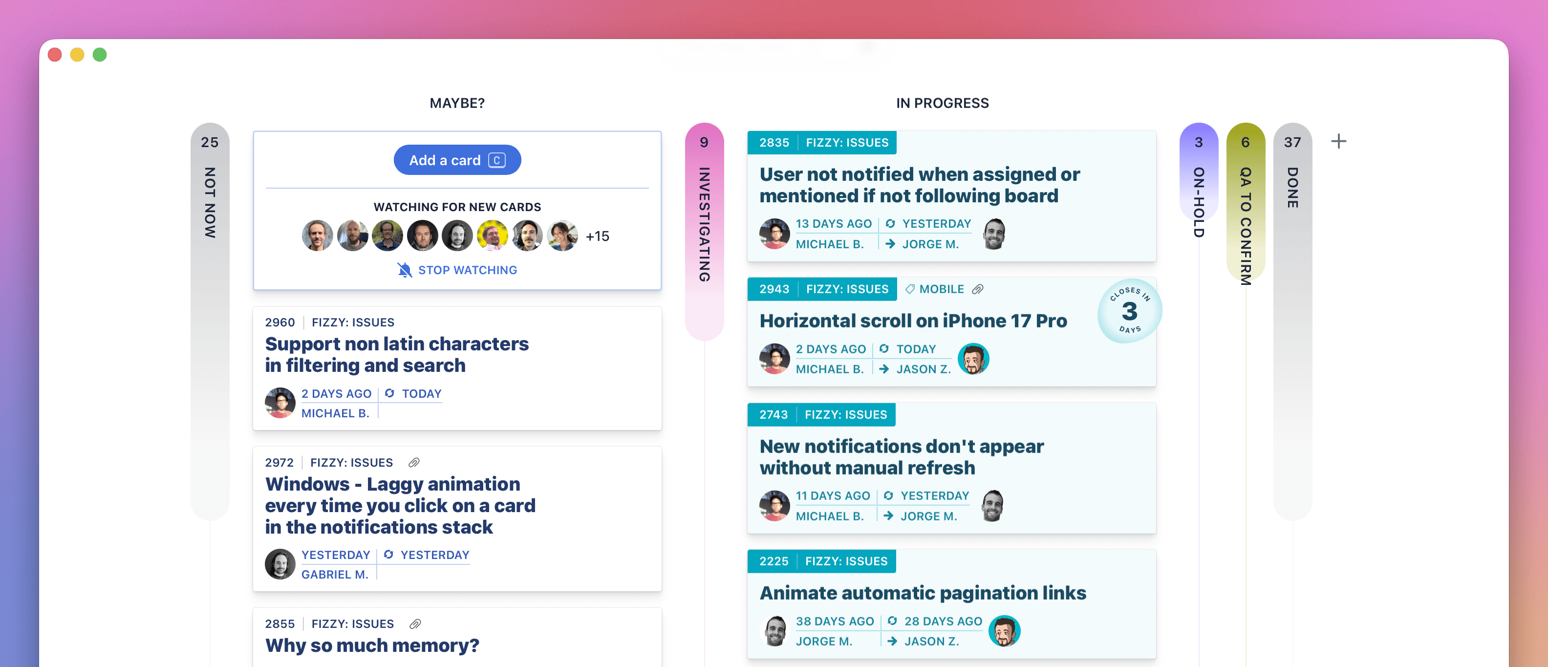
Fizzy is a Trello-style tool for managing projects or content
I confess to having not tried Fizzy yet, but I am very much rooting for any project or content management tool that keeps it simple.
Here's the pitch:
Let’s be honest: every issue and idea tracking tool you loved slowly morphed into boring, sluggish, corporate bloatware. Trello put on 40 pounds of cruft. Jira started charging by the migraine. Asana tried to become everything to everyone. GitHub Issues slid into a steady state of decline. Name one that got better last year. Exactly.
I have used Trello on so many projects, but it has definitely succumbed to the world of enterprise software. I've been tied up in Jira boards more recently and I have no idea what half of it does.
Often, the tool choice is made by a project manager or a team of developers. I think content folk should have far more of a say. Let me know if you give Fizzy a go and how you find it.
"Don’t use emojis as bullet points. Remember that screen readers read the unicode names for emojis. That means that emoji descriptions announced by screen readers may not match the image you thought you chose, which could give a very strange introduction to your bullet list item." Marian Avery, Content Design Ireland
New reader?
Join a growing community of plain language champs and start getting advice and resources that help you write clearer, more accessible content.
Thanks to everyone who shared the last couple of emails with pals and on the socials. Remember, each edition of the newsletter is published on the Plain English Club website. There are also now more than 200 bookmarks tagged up and searchable on the Bookmarks page. Imagine!
Apart from the personal devastation of being just a mere half-decade away from joining this particular user group, there is lots of good stuff in this piece by Bryan Kelly on writing for people over 50:
Designing for older adults isn’t about simplifying everything or creating a “senior version” of your digital experience. It’s about designing with respect, complexity, and care — just like you would for any other audience.
That's the gist of it, but Kelly also includes a range of research-backed personas to help you think about how different people might approach your content. Basically, it's 2025 and we are quite some way past the notion of the 'silver surfer'.
Just because many braille readers would ordinarily visit a destination with another person does not mean that the other person shares their interest in the contents of an interpretation sign or a guidebook. Providing braille materials pre-visit and during a visit enables a visually impaired visitor to gather information at their own pace, without relying on a sighted person to read everything for them.
Slightly related, The Wildlife Trusts recently published a new guide to help organisations develop accessible outdoor spaces. It was developed following research with organisations across the UK and includes some simple, practical advice to help get the basics in place.
This is a link to the latest edition of Adam Silver's very good newsletter. It's a riff on the always-sound advice to start with one thing per page when designing a form. Go read it. Sensible stuff.
Copy and paste text that you have written into the tool and make edits. Or start writing something new directly in the tool. Use the options on the right hand side to find out the reading age of your text. Also find out what might make your writing hard to read. Edit your text and see the reading age change. Once you’ve finished, copy and paste your text from the tool into a word document, email etc.
And now for something a little different with a touch of fruity language.
One of my lovely colleagues shared this blog post by Cap Watkins with me earlier this year and I have thought about it a lot since. Essentially, if you are having a difficult design or content conversation, how much does the issue mean to you on a scale of 1–10?
There have been a few times recently when I could tell someone felt far more strongly about a decision than I did. So, I acquiesced, with the hope that the next time I'm a ten-out-of-ten on a topic with that person involved, they'll recognize that and hear me out. If you can let go of the things that don't matter so much to you directly, you can build currency with others and earn their trust when you do wind up pushing back.
I have found this an incredibly useful mental trick. When you are in the fog of deadlines and challenging work, it is easy to feel like every decision matters and all arguments are worth fighting for. But that's not how true collaboration works.
To work effectively as a team when things get tough and tense, there has to be a bit of give and take. You can't go full steam ahead into every single conversation. It's unlikely that your way will be the right way every time.
So yeah – these are good questions to ask. Is this decision – this argument – really that important to me? Do I feel so strongly about it? Or can I let this one go and save my persistence for a problem that's more of an 8, 9 or 10 out of 10?
"When we hear “older adults,” we often imagine people in their 70s or 80s who struggle with technology. However, the real 50+ audience includes Gen Xers who built the web, older Millennials nearing age 50, and Boomers who continue to shape culture and the workforce. They’re not digital immigrants. They’re digital pioneers." Bryan Kelly
New reader?
Join a growing community of 900+ plain language champs and start getting advice and resources that help you write clearer, more accessible content.