Skip to Content

Clear Language Club

Posts on page 5

25. Power and meaning Newsletter

An inclusive design guide, accessible fonts, measuring content with analytics, better Apple Notes, and the power and meaning of words.

25. Power and meaning
Photo by Jess Bailey / Unsplash

It's only another edition of the Plain English Weekly newsletter arriving in your inbox having literally just been sent by me, Iain Broome.

I don't know about you, but with Christmas now apparently right there in front of us, things are busy, busy, busy. So I won't keep you long, except to say that I hope to run a first Plain English Club webinar early in the new year. Look out for, and I'm not proud about putting it like this, more deets soon.

That's it. Enjoy the links below.

Iain


Screenshot of the landing page for The Inclusive Design Guide. There are four horizontal tabs as menu navigation: Insights, Practices, Tools, and Activities. Below them is an introductory paragraph that explains what the guide is about.
Landing page for The Inclusive Design Guide

The Inclusive Design Guide

Lots of wonderful stuff for you to get your teeth into here:

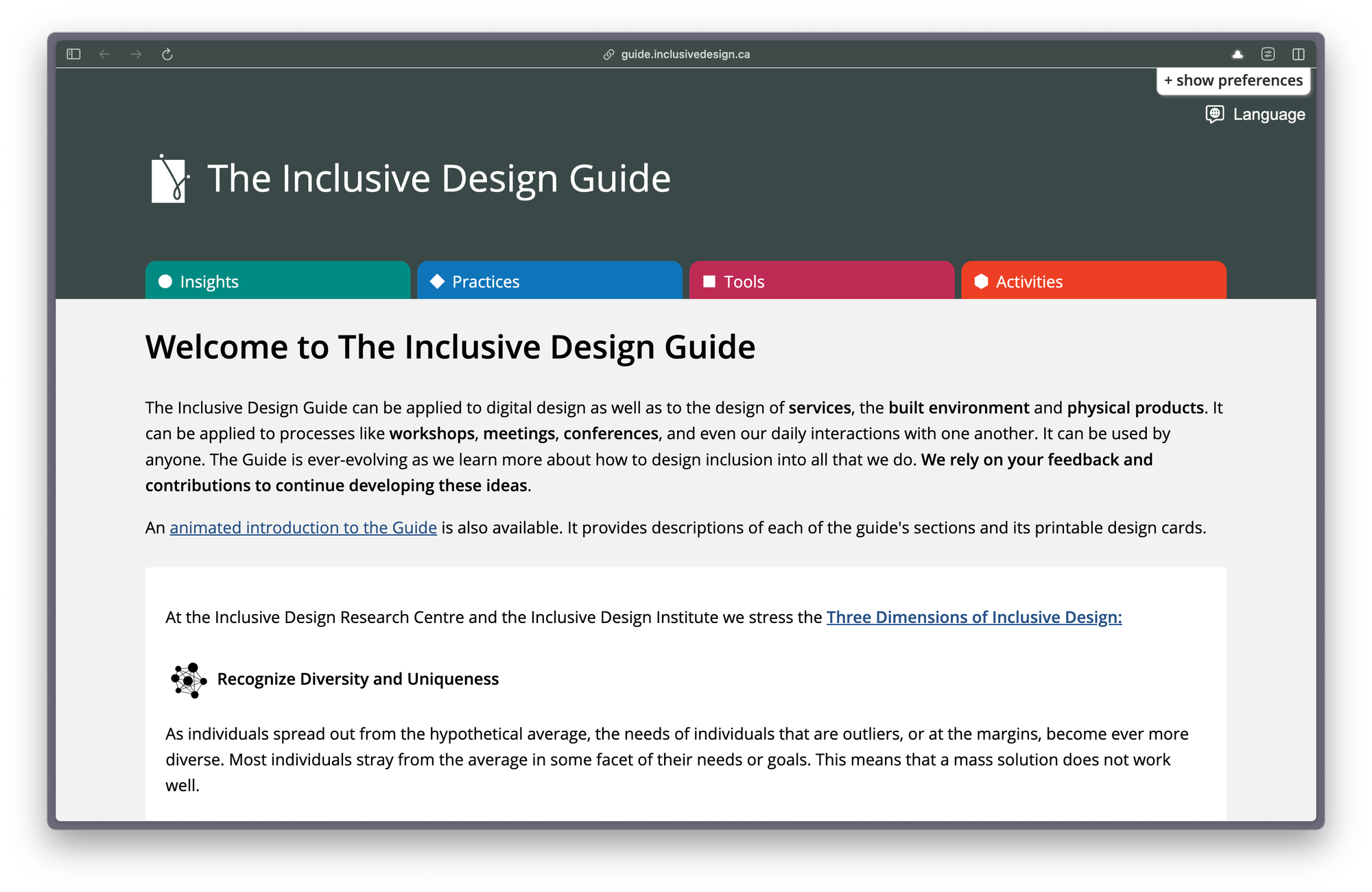
The Inclusive Design Guide can be applied to digital design as well as to the design of services, the built environment and physical products. It can be applied to processes like workshops, meetings, conferences, and even our daily interactions with one another. It can be used by anyone.

By the way, I found this via an excellent collection of accessible design resources put together by Chris Nasrawi.


What makes a good, accessible, easy to read font?

Interesting stuff on accessible fonts from Lizzie Bruce:

When looking for the best fonts for reading, you'll want to consider both legibility and availability. The ideal fonts are not just the easiest fonts to read on web pages but also the fonts available to most of the audience.

On words as worn-out coins

I like this short blog post on words by the Tiny Content team, Nia Campbell and Adrián Ortega. It reminds me of a question I always annoy people with: "What do you really mean?"

Using clear language often forces stakeholder types to properly think about what their policy or paper is saying. Because words are important. They have power and meaning, which is something often forgotten.


Find where your service content isn’t working using web analytics

Super new post by Jack Garfinkel on the Content Design London blog:

When you start measuring the pattern of traffic, you can find pain points and fix them. And the good thing is this method works for 3 pages or for 3,000 pages. 

This is great if you have never tried to measure your web traffic before, but it also provides some useful practical steps for using Google Analytics. As does this page on Google Analytics for content design by none other than the New Zealand government's digital team.


0:00
/0:14

ProNotes formatting bar in action

ProNotes – an extension that adds useful features to Apple Notes

Forgive me for this link, as it really isn't anything at all to do with clear language or content design. But if you use Apple Notes, this one is for you.

ProNotes is a tiny app or extension that adds a few excellent features to Apple Notes, including:

  • a formatting bar
  • being able to write in Markdown
  • slash commands (think Notion or Google Docs)

I've been using ProNotes for a while and I'm not sure I could go back. Oh, and it also happens to be free. Lovely.


"Through words, we create visions of the future, potential realities, and alternative possibilities. But this same language that brings us together and connects us also shapes, and sometimes limits, how we understand the world. Words influence how we think and perceive - and our thinking and experiences, in turn, shape the words we choose."
Tidy Content

New reader?

Join a growing community of 900+ plain language champs and start getting advice and resources that help you write clearer, more accessible content.

24. Paper on walls Newsletter

Accessibility posters, alternative text, a new book on trauma-informed content and an introduction to Frieda Fishmonster.

Grid of six posters showing the dos and don'ts of designing for users with accessibility needs
Posters showing the dos and don'ts of designing for users with accessibility needs

I'm as surprised as anyone, but this in fact another edition of the Plain English Weekly newsletter and yes it is me, Iain Broome, pressing the buttons.

I'm not going to do this every week (promise), but more and more content people are joining Bluesky, so here are the two links I shared last time again.

That's it. Enjoy the goodies below.

Iain


Accessibility posters

I've become a poster enthusiast. Seriously. I helped make some simple design principle posters earlier this year and have been amazed by how useful and well received they have been. Paper on walls. It's the future.

Anyway, you should know about these accessibility posters (pictured above) that you can download from GOV.UK, which include:

General guidance on how to design more accessible services. The guidance covers best design practices for users from these areas: low vision, D/deaf and hard of hearing, dyslexia, motor disabilities, users on the autistic spectrum and users of screen readers.

I'm linking to the HTML version here, but you can also download the posters as a PDF that you can print out and display wherever it will have the most impact. The information is short, clear and extremely important.

I found these posters via this 2016 piece on the dos and don'ts of designing for accessibility.


Designed with Care: Creating trauma-informed content

I'm currently working on a high-profile, extremely sensitive project where trauma-informed content is essential. I feel like I have learned more in the last few months than in my previous 20+ years of being a content person.

And so imagine how pleased I was to find out Rachel Edwards has put together a book on this very subject. I ordered my copy straight away and I'm looking forward to digging in, absorbing it all and comparing notes.

If you are new to the idea of trauma-informed content, I can recommend watching Rachel's Content Folks talk. I've shared it before, but it is well worth 30 minutes of your time.


Co-op's guidance on writing alternative text

A short and simple page that explains the basics of alternative text alongside some examples that are easy to understand. Feel free to explore the rest of the Co-op content guidelines while you're there. It's great.


Inclusion and accessibility for our new website

This blog post is from UK disability charity, Scope and was posted in 2019, so quite mature now in internet years. But to me, it reads like a concise description of how all charities should approach a website redesign.


Cartoon illustration the shows a splendid sea monster appearing out of a teal-coloured sea. It has green scales, purple fins and the most gorgeous eyelashes. Behind it is a cliff beneath an ominous maroon sky that contains a single cloud. The words 'The Fish Monster Roared' are displayed on the cliff walls.
Frieda Fishmonster, described here in the active voice

What is a passive verb?

Finally this week, I take you back into the BBC Bitesize archive for you to meet Frieda Fishmonster. I'm not saying you have to complete these activities as a way or testing your plain English skills, but would it hurt? I won't tell anyone.


"Two million people in the UK have a learning impairment, like dyslexia, that affects their ability to absorb and digest information. So making the website easy and intuitive to use, written in clear plain English, was vital. A mantra emerged of 'great usability leads to great accessibility'."
Scope

New reader?

Join a growing community of almost 900 plain language champs and start getting advice and resources that help you write clearer, more accessible content.

23. Bluesky linking Newsletter

Accessible PowerPoint presentations, inclusive design resources, plain language guidelines, information patterns and naming conventions.

23. Bluesky linking
Photo by Kumiko SHIMIZU / Unsplash

Here we go with another edition of the Plain English Weekly newsletter sent to you very much by me, Iain Broome.

Last week, I mentioned what seemed to be a noticeable increase in people using the social media app, Bluesky. Well, it really does seem to be taking off and I am pleased to report a growing community of content folks on there.

If you want to give it a go, you can:

And that's it. Enjoy the links below.

Iain


Inclusive design resources

Let's start with an absolutely super collection of "posts, articles, guides and podcasts about inclusive design" put together by interaction designer, Benjy Stanton. I also wandered upon his excellent guide to making accessible PowerPoint presentations, which then led me on to the guide below from the Welsh government. Get your bookmarking finger ready.


How to create accessible PowerPoint presentations

On Bluesky this week, I linked to this page from the Welsh government on making accessible PowerPoint presentations and it, as I hear they say, did numbers. Lots of likes. Lots of shares.

I suspect that's because it is full of practical tips like this:

To make a presentation more accessible to people with low vision, save it in an alternate format that can be read by a screen reader. Users can then open it on a personal device or port it to a Braille reader.

But I also imagine it resonated because so many of us put a quick deck together and likely do not think about accessibility at all. But we should! Even if it's an internal presentation for colleagues, we should aim for best practice and meeting the needs of all users.


Federal plain language guidelines

I'm not sure why I haven't linked to this most marvellous resource before, but it should go straight into your bookmarks:

These are the official guidelines for the Plain Writing Act of 2010. We developed these guidelines to help you and your agency write clearly, so your users can find what they need, understand what they find, and use what they find to meet their needs.

And I should say I got a gentle nudge about this page from forms expert, Caroline Jarrett of Effortmark. Caroline also shared lots of other brill links that I am going to add to Bookmarks too. Go check out the Effortmark blog!


Information patterns and narrative structures in content

Another ace article by Lauren Pope here:

In this guide, we’ll explore 10 patterns for structuring your content to maximise understanding, engagement, and effectiveness. There’s also a matrix to help you choose the right structure based on your specific content objectives. 

I've linked to a few of Lauren's pieces now, which means she has an official tag in Bookmarks. Those tags are quite a nifty way to explore the directory by the way.


How to respect international naming conventions and design inclusively

Interesting post from June Caldwell via Sparck on how countries and cultures have different naming structures. It comes with a handy list of practical tips for designing more inclusive name fields in your forms.


"Word choice is an important part of communicating clearly. While there is generally no problem with being expressive, most federal writing has no place for literary flair. People do not curl up in front of the fire with a federal regulation to have a relaxing read."
Federal plain language guidelines

New reader?

Join a growing community of 850+ plain language champs and start getting advice and resources that help you write clearer, more accessible content.

22. Seriously bad chats Newsletter

How people read, writing inclusive and accessible letters and emails, and a dyslexia-friendly style guide.

Screenshot of an article called How people read on Content Design London's Readability Guidelines

Here's another edition of Plain English not-so-Weekly plucked from a gap in time and sent right to your inbox. I'm Iain Broome, in case you've forgotten.

Forgive me once more for being so tardy with these emails. It has been a very busy few months indeed. I do still have lots of lovely plans for this newsletter and its associated content. Promise!

Have you noticed lots of people who work in content and user-centred design moving from Twitter to Bluesky this week? Seems like it could be an exciting development. You can follow me on Bluesky if you are there too.

That's it. Hope you are magical. Don't forget your bookmarks.

Iain


How people read

An excellent thing to point to when you are having seriously bad chats with people who want to make things more complicated:

People come to your site to use it not visit it. They're there to do a task, or get information to help them do a task offline. Even if their task is to gain knowledge, they want to find and add it to their personal information bank, their brain, as quickly as possible. They'd download it directly if they could.

This is from the ace Readability Guidelines by the way.


How Do I Ensure My Letters and Emails are Inclusive and Accessible?

I've spent more time in the last few months writing letters than I have my entire previous 43 years. It's tricky, I tell you. But this advice from Historic England, of all places, is very useful.


Dyslexia-friendly style guide

Super handy style guide from the British Dyslexia Association, which includes nuggets like this:

Use sans serif fonts, such as Arial and Comic Sans, as letters can appear less crowded. Alternatives include Verdana, Tahoma, Century Gothic, Trebuchet, Calibri, Open Sans.

See also the Dyslexie font, designed specifically for people with Dyslexia.


How to write hyperlink text for better web accessibility

If you ever see a colleague, or dare I even say friend, writing 'click here' links, please send them to this page from Scope immediately. I wouldn't be against you giving them a mild ticking off, to be honest.

In short, people want to know where they’re going if they click a link.​ The text you use in hyperlinks should tell them.

I published something similar about writing good hyperlinks many years ago.


Do not use "reading age" when thinking about adults

It is so common to talk about reading age and yet it seems so obviously the wrong thing to do. This post from Caroline Jarrett at Effortmark explains why:

Do not use “reading age” when thinking about adults. It’s not helpful, and it fails to acknowledge the life experience of people with reading difficulties.

You should also take a look at Caroline's post from way back in 2010 on writing for people who do not read easily.


"How you write an email or a letter often depends on the audience. As a general rule, you should aim to make your correspondence as easy to read as possible, not least because people usually have many emails or letters to get through."
Historic England

New reader?

Join a growing community of 800+ plain language champs and start getting advice and resources that help you write clearer, more accessible content.

21. Excellent pronoun usage Newsletter

Designing for people with limited English, charities and content design, conflicting access needs, and how to use personal pronouns.

21. Excellent pronoun usage
Photo by sydney Rae / Unsplash

Welcome to another edition of Plain English Weekly, the newsletter for plain language champions that has a highly inaccurate name!

Yes, forgive me for the inconsistent schedule. This summer I have found myself working on what is likely to be a career-defining project and it's meant I've had to prioritise. Content prioritisation! It's a real thing.

Chances are I may tweak the format of the newsletter so that I can still send you an email, even when I'm busy. Basically, remove my waffly bits.

Last thing. Thank you to everyone who has shared Plain English Bookmarks! It's had thousands of visits over the last few weeks and I'm adding new links all the time. It can only grow from here. I'm so pleased folk are finding it useful.

Okay, enjoy the exciting internet articles listed below.

Iain

PS If you are new to the newsletter, I am Iain Broome. I run my own freelance content design studio. And you are extremely welcome.


Designing for people with limited English

So much useful stuff here in this page from the UK Home Office's content style guidelines. I've had to write and design content for people who don't speak English as a first language and it can be a real challenge to get it right. That said, it's worth noting that a lot of the advice here applies to content for pretty much anyone.


Why it’s time for charities to embrace content design

This piece from the ace Lauren Pope appears on the CharityComms blog. I know that there are lots of people who work for charities and read this newsletter, so please do go check this one out if that's you!


Designing content for conflicting access needs

Great post from Stephanie Coulshed writing on Scope's Medium account. Here's here handy definition of conflicting access needs:

Conflicting access needs are when the access need for one person is the opposite of what someone else needs.

I am dealing with this exact problem at the moment in my own work and it is not at all straightforward to solve. But as this post frequently mentions, there really is nothing like testing content with real people to understand how it might be improved to cater for more, if not all, needs.


Black and white illustration of a Windows PC keyboard with the two shift keys highlighted to show their position.
Flash card designed to help teach digital skills to people who don't speak English

Understanding users who do not use digital services

Hey, remember just above, when I said that I had experience of writing for people who had limited English? In one case, those people had very limited digital skills too. And my task was to create learning materials that would teach them some basic digital skills. I can tell you there were flash cards involved (see image).

Anyway, there are lots of other reasons why people don't use digital services and this page from the GOV.UK service manual pops them in a list for you. You will also find some good advice on how to carry out research that helps you understand why people might not be using your service in particular.


The lowdown on personal pronouns and how to use them

One of the principles of plain English is to use pronouns, such as we, our, you and your. It makes your writing more direct and its tone more warm and human. I'm sure your own content is full of excellent pronoun usage. But if you want to get all technical about it, this guidance from the British Council is full of examples.


"Research has found that technical language and long documents make people with limited English anxious. If you need to use technical language, provide a clear language explanation."
UK Home Office, Content Style Guide

New reader?

Join a growing community of 800+ plain language champs and start getting advice and resources that help you write clearer, more accessible content.

20. Introducing Bookmarks Newsletter

The launch of Plain English Club Bookmarks, the active and passive voice, subtitles and captions, and an intro to user research.

Screenshot of Bookmarks landing page, which shows 12 topics, each with their own icon
Bookmarks are filed under 12 exciting topics

Welcome to a slightly special edition of Plain English Weekly, a newsletter for clear language champs sent by very much me, Iain Broome.

Today I am two-toots excited to share Plain English Club Bookmarks, a free and ever-expanding collection of clear language resources. Actually, it covers other topics too, like content design, user research and inclusive content.

This is the first product (let's call it a product) beyond the newsletter as I try and build out the Plain English Club website. Earlier this week, I shared it on LinkedIn and have been mildly flabbergasted by the response.

I'm not going to bother you with any more information here. You can learn all about Bookmarks and start exploring via the magic button below.

Oh – feedback! Please do let me know what you think and where you feel it can be improved. And if you have resources that I should know about? Contact me and tell me about those too.

Enjoy the new links below.

Iain


🎓
Plain English training for your team
Quick note to say I run exciting plain English workshops with teams from all sorts of organisations. Email iain@verymeta.com if you'd like to know more about how they work.

What’s the difference between ACTIVE & PASSIVE?

This is a pretty good explanation of how the active and passive voices are different. It's also a good example of what I (and others?) call the 'slow internet'. By which I mean it's a person with expertise just taking their time to talk through a subject with care. Nothing flashy. No jump cuts. Not scripted to within an inch of its life. It's two thumbs from me. 👍👍


Subtitles, Closed Captions, and Open Captions: What's the Difference?

This is an extremely useful post by Ben Myers:

In everyday language, terms like captions, closed captions, and subtitles all get used pretty interchangeably — and the [CC] abbreviation stands as shorthand for all of them. Within the professional transcription industry and amongst many deaf and hard-of-hearing consumers, however, these terms often have very particular meanings. Knowing the differences between them can help you pick, and better understand, the access tool that's right for your content and your viewers.

Plain language for academic & professional writing

Some good, sensible plain English advice in this piece, but you might also find goodies in the handy list of other resources it provides. Big thanks to Cheryl Cline for sharing this with me over on LinkedIn. All suggestions welcome!


User research for government services: an introduction

I've been lucky enough to take part in hundreds of user research sessions over the last few years. This guide is from the UK government's excellent service manual, but it's full of brilliant information if you are curious about user research and want to do some in your own organisation. Why would you? It's an excellent way to work out what the people you are writing for actually need.


"Even in the midst of the generative AI hype cycle, manually curated transcriptions are still the best, most accurate experience, and they are invaluable for folks who need them."
Ben Myers

New reader?

Join a growing community of 700+ plain language champs and start getting advice and resources that help you write clearer, more accessible content.