

Welcome to a new-look, announcement-addled edition of the Clear Language Club newsletter, still sent by me, Iain Broome.
It took a little longer to get here than planned, but I am pleased to tell you that the Clear Language Club blog is now live. Imagine!
It’s no ordinary blog, either. It combines different types of post with a focus on ‘link posts’. If you don’t know what the heck I mean by that, do not panic! It’s all explained in an exciting launch post.
Don’t forget, you can always reply to these emails. I’m just a wally with a keyboard and a dream. So do share your feedback. Tell me your thoughts.
And now on to the good stuff. Enjoy, enjoy, enjoy.
Iain
Good content
How to do a website content audit
An essential for your bookmarks – Lauren Pope provides all you need to know when it comes to planning and then doing a content audit. It's a brilliant resource, whether you're an old hand or auditing for the first time.
Top, right and other directional text
While I do think you should 'check out the links below', this is not a good way of pointing you in the right direction. Marian Avery at Content Design Ireland explains why and suggests some alternative ways of telling people where to go on a web page.
Designing for people with anxiety
A fab guide on the Tetra Logical blog that looks at how people with anxiety may experience your content. And of course, how you can make the process easier for them. I already shared this piece on the blog with some thoughts of my own.
Documenting a service as a content designer
This post by Amy Noss at Kainos covers all the reasons it's a good idea to document the content decisions you make. If you work in a large team or with other content bods, it's a must read.
Why delivering simple content isn’t simple
Matt Billingsley on the Content Design London blog looks at the idea of 'simple content' and how really, perhaps you need to get some systems in place first. Clear goals, user needs and shared standards. That kind of thing.
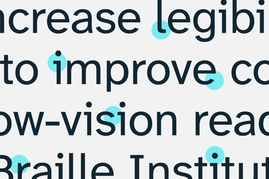
Choosing an accessible font
I have used (and heavily fiddled with) a custom Ghost theme for the Clear Language Club blog. I know it looks like a bit like Bluesky, but it gives me the foundations to do the things I need, like link posts.
Anyway, the theme comes with a few fonts to choose from. At first, I went with good old Inter. It's popular and fairly uncontroversial. Lots of people like it. I quite like it.
But then I thought, "This is a website about clear, accessible language. Surely there is something more appropriate out there?" And so off I went – on a wild font chase – to find a typeface that would make the blog easier to read for more people. Here's what I found.
First, this great explainer on accessible fonts provides some context if you need to persuade someone important that having a readable font is a good idea. And this post by Lizzie Bruce covers what actually makes a good, accessible, easy to read font.
If you want to get really into the weeds, I also recommend this detailed guide to what makes a typeface accessible by Gareth Ford Williams.
After lots of searching and much link following, I narrowed my search down to two fonts. They are both free, open-source and, quite handily, described in Kristian Mikhel's post on inclusive typefaces.
In fact, that post also mentions a font called Dyslexie, which is great for people who are dyslexic, but not right for Clear Language Club.
Inclusive Sans is a really lovely font that ticked plenty of boxes. It's designed for high readability and looks ace, but I couldn't get over how similar some of the letters are. For example, the upper case I and the lower case l are hard to distinguish. And as person called Iain, this is a known issue.
So in the end, I went with Atkinson Hyperlegible Next, a font developed at Braille Institute. It's designed specifically for people with low vision, but has features that make it easy on the eye for everyone. I think it looks fantastic. Kicks and flicks everywhere. It's even available through Google Fonts.
I know it can be hard to make a big font change when you work at an organisation with an established brand. This is just a humble blog and I can do what the heck I like. However, do feel free to send some of these links to your designer pals or boss-like colleagues. It might just get a good conversation going.
Links from the past
Exciting articles and resources shared in previous editions.
- The case for jargon
- Why you should avoid PDFs and what to do if you can't
- South Tyneside Council's super-simple style guide
- Challenging ageism: Inclusive writing for the 50+ audience
- Using visual content in an accessible way
Don't forget, you also have a growing list of 250+ brilliant bookmarks to browse and enjoy on the blog.
Things to do now
Have I mentioned the new Clear Language Club blog? Go check that out and read the launch post if you haven't already. I recommend the RSS feed and using a free feed reader app to get new posts as they are published.
If you are new to the newsletter and want to subscribe, there is an official newsletter page. I also recommend the new about page too if you want to know more about the project and what it's all about. Oh – there is even a changelog!
Comments