Skip to Content

Clear Language Club

Posts on page 4

31. Specialised language Newsletter

Designing for people with autism, using specialised language, not 'owning' the words, and some AI label testing.

Scrabble tiles spell out the word 'Lanaguge' on a table, which has the corners of four devices around it, including a phone and laptop.
Photo by Ling App / Unsplash

Here we are, back once again, not with the renegade master, alas, but a new edition of the Plain English Club newsletter. Sent by me, yep, Iain Broome.

I know four commas in the opening sentence of a newsletter about plain English is not ideal, but we are where we are. Thank you to everyone who shared the last email I sent you. Lots of new readers as a result. Hello new readers!

Without further faffing, on to the good stuff.

Iain


Use Specialised Language for Specialised Audiences

There is plenty in this Jakub Nielsen post from 2014 that applies today:

Even for specialised audiences it’s still best to write as simple as possible. Even highly educated people don’t want to struggle to read your site. You do not impress anybody by spouting highfalutin words or complex sentence structures that require careful parsing. People don’t pay close attention to web content.

He then goes on to make the case for using 'specialised language' if you are sure that the person reading knows what it means.

Specialised language is not only more concise but also clearer, as long as the reader is a specialist who understands the terminology.

I think this is still pretty good advice too. And I think the thrust of what he is saying is all wrapped up in the principles of what we now call content design. Effectively, before you write or design any content, make sure you understand who it is for and how they will use it.

That said, the one thing in the piece that I do strongly object to in this article is the bit about writing for specific 'reading ages'. Caroline Jarrett has covered this perfectly in her piece about reading age.

Do not use “reading age” when thinking about adults. It’s not helpful, and it fails to acknowledge the life experience of people with reading difficulties.

Don't forget you can find lots of other articles on this kind of thing in our shared list of Plain English Club Bookmarks!


From Shelter's style guide: Writing online content

Shelter is one of a handful of UK charities that do a two-toots tremendous job of publishing their approach to content on their website. I am a fan of this humble page on writing online content, which is concise and absolutely packed with useful, practical guidance for their content designers and writers to follow.

By the way, is it time to officially launch 'style guide of the week' as, you know, a thing?


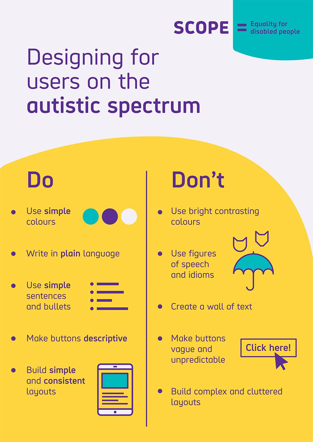
Designing for people on the autism spectrum

Another excellent resource from the frequently linked to (by me, especially) team at UK disability charity, Scope.

This isn't a bad place to start from with all your content:

It’s important to remember that how anyone chooses to talk about their impairment is up to them. If you’re referring to a particular person or group of people, always ask them how they would prefer to be described.

But if you specifically want or need to create content for people with autism, you'll find a list of useful, research-backed guidance. You can also swipe, print and share this handy infographic that covers the main points.

Illustrated infographic titled 'Designing for users on the autistic spectrum' that features two lists with the titles, Do and Don't.
Infographic on designing for people with autism

Content designers don’t ‘own’ the words. We never have

This post by Jane Van de Ban is pretty spot on about how misguided this notion is that content folk 'own the words'. I have previously used that phrase myself or perhaps, even worse, said that I or we 'own the style guide'. It's not really true though. Words and style guides are for everyone. Lucky people.


How we’re designing user-centred AI labels at the BBC

This is interesting insight into how the BBC are testing ways they disclose how AI has been used on their web pages:

AI labels have been appearing across all areas of tech, including social media, but we’re yet to see a consistent, transparent, truly user-focused and easily understood approach. That’s what we’ve been working on at the BBC. Over the past year, we’ve been developing a labelling approach that’s rooted in audience needs, designed to work across all our products, and focused on two main things: transparency and trust.

Some of the research findings so far are perhaps not surprising:

Throughout our research into AI labelling, audiences told us clearly that they don’t just want to know when AI is used, they want to understand how and why it is used.

There is lots here for you to get your teeth into and help you think about your own work. That said, I do find it a bit frustrating that there seems to be a working assumption here that audiences actually want AI at all.

The testing is being done on live sports pages. I follow live sports pages (especially cricket). The journalists who write that content are very good at it. They are funny, erudite and able to describe and convey the emotion and sense of community that comes with watching and enjoying live sport. It's a very human thing.

I dunno. I do try not be that guy when it comes to AI – I vibe coded the living daylights out of Bookmarks. But it does feel important for user research to ask, "Should we do this at all?" and not just, "We've done it. Do you trust us?"


"In the end, words on a page or in a service or in a print source don’t belong to any of us. They belong to our users - the people who need them in order to get their new passport, or book their train travel, or find out about the healthcare they need, or whatever it is they’ve come to our digital space to do. And our users don’t care who ‘owns the words’ - but they do care about getting things done."
Jane Van de Ban, Roxboro Design

New reader?

Join a growing community of almost 1000 clear language champs and start getting advice and resources that help you write clearer, more accessible content.

30. Some actual evidence Newsletter

User stories, content portfolios, words to avoid, navigating AI and a post on trauma-informed content design.

30. Some actual evidence
Photo by UX Indonesia / Unsplash

Hold your horses – this is a new edition of the Plain English Club newsletter. It's arrived in your inbox via the computer and keyboard of me, Iain Broome.

Sorry I have been so bad at sending newsletters this year. I hate being bad at sending newsletters. Rest assured, I plan to be better at sending newsletters for the rest of 2025. And this one is full of excellent content.

Many high fives,

Iain

PS Remember, if you do not want me to send you emails like this anymore, you can unsubscribe using the link in the footer or by signing in on the Plain English Club website.


User stories for content design

This post by Jack Garfinkel gives you an excellent overview of all things user stories. I can't recommend it enough.

If you are already a content designer, this is where you should send people when you are trying to explain user stories. If you are a copywriter or general clear language enthusiast, user stories are how you can make sure all that plain English you are writing is actually doing its job.


Creating a content design portfolio with no UX experience

This by Emily Wachowiak from Mozilla on the Button blog is good if you are new to the content world. I agree that real project work is the thing to shout about, even if that work feels small to you.

Work produced under real-world conditions showcases far more than your content design skills — it shows you know how to collaborate with a cross-functional team to solve problems and handle the setbacks, technical constraints, and compromises that inevitably pop up. 

Another recommendation from me. If your current role is not strictly in content design, you can still use some of its principles.

For example, if you work in marketing or communications, you can carry out some guerilla user research before you start writing copy. Or you can dig into your organisation's web analytics to see what search terms people are using to reach your website.

Then, armed with some actual evidence, you can take your findings to your bosses and say, "Hey big dogs! I think we should take this approach because it's what our users appear to want and need. Tell me I'm wrong!"

Best case scenario, they agree and allow you to take the first steps in reshaping your current role. You might even revolutionise the entire organisation! Worst case scenario, they tell you to pipe down and get the heck out.

Either way, you have done some content design work that you can add to your fledgling portfolio.


Trauma-informed content: what I've learned from the frontlines

For the last 16 months, I've been working on an extremely sensitive project where trauma-informed content design has been essential. As a result, I am a roughly one squillion per cent better content designer for the experience.

This post by Adrie van der Luijt gives you an idea of what trauma-informed content is and why it matters.

This is the reality of creating trauma-informed content that actually works. It’s not about theoretical frameworks or academic principles. It’s about understanding how trauma fundamentally changes how people process information and then having the courage to fight for their needs against organisational pressure to water things down.

The post also features several examples of trauma-informed content:

At Universal Credit, we discovered people needed absolute clarity. They didn’t want “your claim may be affected if your circumstances change” – they needed “you must tell us within 14 days if you start work or your benefits will stop”.

Assuming you too work in the content world, I strongly recommend you spend some time reading up on trauma-informed design. There are other useful posts on Adrie's blog and Rachel Edwards wrote an excellent intro, which I have linked to before.

I've also created a tag for trauma-informed content in my bookmarks collection if you need a place to start.


Just Keep Writing – On "content design" in the AI era

There are many hot takes on AI and how it is affecting us content bods flying about the internet right now. I quite like this one by Danielle McClune.


Words not to use

Brill list of words to avoid from the style manual of the Office for National Statistics. I always like it when these lists are either grumpy or include at least a little humour in them. Ideally, both.

For example:

drive out (unless it is cattle)

And:

deliver (pizzas, post and services are delivered – not abstract concepts)

And perhaps my favourite:

one-stop shop (we are not a retail outlet and creating a single place for everything often does not meet user need)

"Maybe the future of content work looks different from what we're used to. AI systems desperately need quality writing in places most people don't even think about: evaluations, taxonomies, training datasets. And the core skills of a great writer aren't going anywhere. You can't prompt your way into good judgment. That comes from experience, practice, and something you definitely can't automate: taste."
Danielle McClune

New reader?

Join a growing community of almost 1000 plain language champs and start getting advice and resources that help you write clearer, more accessible content.

29. Brand new bookmarks Newsletter

Redesigned directory of 170+ bookmarks, content for people with limited English, an information architecture case study.

29. Brand new bookmarks

Forgive me, for it as a very long time since the last edition of the Plain English Weekly newsletter. And yet here is a new one.

Two pieces of information. First, there is no sign of me becoming less busy, so let's change the name of this thing to Plain English Club* instead. There, done. And now let's aim for send this every two weeks or so. Cool, cool.

Next, may I point you towards a completely reworked 'Bookmarks' section of the website? With some DIY coding and a little help from Claude, I have managed to get our full directory of links all in one place. That includes categories, pagination and even a handy search tool.

Without wanting to sound like too much of a wally, I think this is already an excellent resource for all content folk and will continue to grow. Oh – and it was shared on LinkedIn this week by Vitaly Friedman, the chap who founded Smashing Magazine.

That's it. Enjoy some excellent information below.

Iain

* The URL for the web version of the newsletter has always been plainenglish.club so this is not exactly the biggest change in the world.


How content, content design, and content strategy fit into the bigger business context

It was great to see a new talk from the team over at Content Folks pop up a few weeks ago. This one is about content shapes and is shaped by an organisation, and it's by the excellent Hilary Marsh.

Do go and browse other talks on the Content Folks Youtube channel.


Free content tools and resources, curated by Cake Design Studio

I was recently added to the brilliant user-centred design (UCD) directory in my capacity as a freelance content bod. It's put together by Lizzie Bruce from Cake Design Studio, who also happens to have their own lovely list of free content tools and resources for you to explore.


Designing content for people with limited English

Please, please do read this blog post from the Home Office Digital, Data and Technology team:

People may interact with the Home Office at stressful times in their life, which already affects comprehension. Research has also shown that long and technical content makes people anxious. This makes the use of clear language really important. And though you already do this across all your services, you may have to be even plainer than you think.

It's also full of practical tips and examples. And though this advice is about writing for people with limited English, much of it applies to other groups of people too. Like, pretty much everyone.


Plain language – the choice is clear

Some good stuff about the barriers to and benefits of writing in clear language from from the Australian government. I also note the enjoyable but hopefully tongue-in-cheek sub-heading of 'Obfuscation', while also hesitating slightly over the notion that clear language is 'good for busy people'. Mate, we're all busy. All the time.


When to use tables and how to make them accessible

Thinking about making a table? Before you do, take a minute to read this marvellous information from the GOV.UK style guidance.

For example:

Use tables to present data or information that can be organised in a structured way. This could consist of numbers, text or statistics. [...] Do not use tables for cosmetic reasons or when you can use normal page structure to present the information, for example headers or lists.

The section on accessibility is especially important and worth a look.


An information architecture case study

An excellent piece by Lauren Pope, who used several techniques for developing sound information architecture on her very own website. I really love this way of working in the open and explaining the work too. Great stuff.

By the way, Lauren has lots of great articles on her website and even has her own tag in Bookmarks. Just search for her name.


"Using plain language improves comprehension. In other words, it makes content easier to understand. Users can struggle to understand long words, technical jargon and unfamiliar terms. We often see this in areas like health, law and finance. In these situations, complex language can cause confusion and even harm."
Australian Government Style Manual

New reader?

Join a growing community of 900+ plain language champs and start getting advice and resources that help you write clearer, more accessible content.

28. Change is good Newsletter

The four phases of UX writing, running a tone of voice workshop, writing clear headings, free guides and writing about disability.

Pavement with an electric station in the foreground and parked cars behind it. On the doors, someone has spray painted 'Be the change' and a love heart.
Photo by Maria Thalassinou / Unsplash

Welcome to another edition of the Plain English Weekly newsletter, sent your way again by me, freelance content design bod, Iain Broome.

Did you know that every time I send an email newsletter, a version also gets published to the Plain English Club website? Well it does and not only that, you can leave comments and we can all have a very nice content chat indeed.

This is not a feature I have really pushed (or even mentioned) before, but people do always reply to me via email or social media. And those conversations are usually interesting and insightful. I like talking about clear content!

So what do you think? Shall we give it a go? If you find something in this week's newsletter that makes you want to share your thoughts, head to the website version and do exactly that.

Like, what's your favourite link and why did you find it useful or interesting? How does what you found in this email relate to or inform your own projects? What the heck are you even working on at the moment?

Some other ideas for writing comments:

  • "I really like this article and will use the information in this exciting way."
  • "This is a great read! It very much reminds me of this other useful resource you should know about."
  • "Hey, thanks for sharing, really interesting. Can I respectfully disagree with some of it in the following way."

You know the drill. That kind of thing.

You won't be surprised to find that the comments section appears at the end of each post. Look out for the 'Member discussion' heading and don't worry, you don't need to sign up again. Just use the 'Sign in' link and the email address you used when you subscribed to the newsletter.

Email iain@verymeta.com if you need any help.

Screenshot of an empty comments section on Plain English Club website. Heading text says 'Member discussion' with a smaller invite to 'Start the conversation' and sign up or in to leave a comment.

That's all. I look forward to your comments!

Enjoy the links below.

Iain


UX Writing: How to Get the Writing Done

Content designer, Scott Kubie has a personal website absolutely full of content-related resources. I can recommend this short talk on the writing process that sets out four stages for each 'assignment'.

It's all great, but I want to particularly second the idea of creating an outline before you get started. That could be a few bullet points, draft headings or even a sentence that describes what will go where.

Things might change when you get into the meat of things, but that's okay. Everything changes. Change is good. Life is change.


A guide to running a tone of voice workshop with your team

Ever thought about running a tone of voice workshop with your team or even someone else's team? Well then this is going to be a very useful article from Nia Campbell and the Content Design London crew.


Using clear and effective headings

I'm always slightly fascinated by the way different organisations in different sectors present their style guidelines. Here is Imperial College London on writing good headings and I can't see much I disagree with.

It includes the following statistic and link:

According to a WebAIM survey of 1,539 people in January 2024, 71.6% of screen reader users navigate pages using headings.

Make as note of that, as it might come in handy for future discussions with your senior leadership team or design colleagues.


Free guides on writing clearly

A wide range of free resources from the Plain English Commission, including a collection of short booklets and a single-page PDF [82KB] that features 15 tips on writing Plain English.


Inclusive language: words to use and avoid when writing about disability

Useful page from GOV.UK guidance to add to your bookmarks. It includes guidelines on collective terms and labels, everyday phrases and words to use and avoid. The latter is presented in a handy table format too.


"Consider carefully your purpose and message before starting to write – clear writing and clear thinking go hand in hand."
Plain Language Commission

New reader?

Join a growing community of 900+ plain language champs and start getting advice and resources that help you write clearer, more accessible content.

27. Ask good questions Newsletter

Trauma-informed design, good user research questions, unconscious bias, how to name a service, and content design at Scope.

Lower half is a crowd of people in a large room, many of which have their hand in the air as if asking a question. Top half is a large dark wall with a shaft of light coming in.
Photo by Edwin Andrade / Unsplash

This is the first edition of the Plain English Weekly newsletter sent in 2025. I hope you've got off to a good start, despite... everything.

I would have sent this sooner but I decided to write a review of my 2024 that got a bit out of hand. It's mostly a rundown of the content projects I worked on throughout the year with a sprinkling of thoughts on freelancing.

Oh, I also updated my freelance website too, almost entirely to avoid paying another £150 to Squarespace. It's a one-pager, but I quite like it.

No more waffling. Enjoy the links below.

Iain


Trauma informed design

I heartily recommend you listen to this episode of the Accessible Numbers podcast from Laura Parker. It features a chat with content designers and trauma-informed content specialists, Jane McFadyen and Rachel Edwards.

I think I have mentioned it before, but I have spent the last few months working on a project where trauma-informed design is essential. It's been very challenging but also hugely rewarding and I have learned an awful lot in the process.

This conversation is a brilliant introduction to the idea and principles of designing content for people who have experienced trauma. And to be honest, it's a great listen no matter who you typically design content for.


Asking good user research interview questions

This is a very concise and therefore rather handy guide on how to ask good research questions from The National Council for Voluntary Organisations (NCVO):

Don’t just ask people what they want. Instead ask why they want it. That has much more value. Even better is asking about past behaviour. Behaviour is more reliable than predictions or views and opinions.

There is also a similar guide to planning user research.


Dealing with unconscious bias

You know what, I'm going to go ahead and share this piece on unconscious bias too, which is also from NCVO:

Unconscious bias is also known as ‘implicit bias’. It's the social stereotypes we have about people who are different to us. For instance because of their race, gender, cultural background, body shape, sexual orientation and class or because they are disabled. It’s one of the biggest obstacles we face when creating digital content, software and services.

Naming your service

Along with some content colleagues, I am currently doing everything in my power to make sure we do not use the word 'portal' or 'hub' or anything similar to describe the service we are building. In the public sector world, this is largely a solved problem! Just follow these guidelines in the GOV.UK service manual.


How the team do content at...Scope

I've linked to lots of great pieces and guidance from Scope in this newsletter. Stephanie Coulshed leads the content design team and this (written) interview with Lauren Pope is full of fascinating insights. I too am a fan of the simple Kanban board for managing and working on content!


"Thinking about support and advice content specifically, I would hope to see more research into people’s information needs and the context in which they are searching for content. Content should be about what people need to know, not what we want to tell them!"
Stephanie Coulshed, Scope

New reader?

Join a growing community of 950+ plain language champs and start getting advice and resources that help you write clearer, more accessible content.

26. Say what you mean Newsletter

Accessible text, actionable language, Monzo's writing principles, a Trello template for planning content and a handy copy and paste tool.

White neon sign on a black background. Text says: 'Blah Blah Blah'
Photo by Nick Fewings / Unsplash

It's time for this year's final edition of the Plain English Weekly newsletter, which very much continues to be whisked your way by me, Iain Broome.

I have nothing deep and meaningful to say, apart from thanks for reading and clicking the links over the last 12 months. I've certainly perked up over the last part of 2024 and got back into a regular publishing schedule.

That's partly because there are so many of you subscribed (900+ people) and reading regularly now (60% open rate). But also because it genuinely warms my cockles to know that other people share my enthusiasm for plain English, clear language or whatever else you want to call it.

I do have plans to expand the website in 2025 and try new stuff. But for now, enjoy the links below and have your very best holiday period ever.

One thousand festive high fives,

Iain

🔖
Plain English Club Bookmarks
Don't forget, you can search and get thoroughly lost in our very own directory of bookmarks. All tagged and placed in sensible topics, you can find every link I've ever shared in the newsletter (and more!).

A beginner's guide to accessible text

This is one of many useful articles I just discovered on the Pope Tech blog:

Visual users consume most web content by reading text. Poorly formatted text can make it hard for anyone, but especially users with a visual or cognitive disability, to read and understand the content.

You might think some of the information is pretty basic, but I'll bet you've found yourself in heated chit chats with people (probably senior people) on these topics before. So this is a good place to send them to when the time comes round again.


Actionable language

This page on actionable language comes to you your straight from Shopify's content guidelines. One of the principles of clear language is to give instructions. To be clear and say what you mean. To help people do what they need to do. This page is full of examples that show you how to do just that.


Monzo tone of voice and writing principles

You might have seen Monzo's writing principles before, but I quite like them because they show it's possible to be clear and have a strong tone of voice. They also effectively a list of plain English principles if you read closely.


Screenshot of Trello, a task management app. There are five columns: Backlog, Preparing content, Awaiting Review, Done and need to be published, and Published. Each column has different cards that describe tasks that need to be completed.
Simple Trello template to help you manage content

Trello template for planning your content project

I still use Trello to organise projects and content and whatever else I happen to be working on. It's more bloated than it needs to be, but it does still do the things that you need to organise your bits and bobs. This template is very similar to the one I tend to use and is pretty good for getting started.


Pastebot – a super copy and paste tool

Do you do a lot of copy and pasting? Have you ever used a clipboard manager before? Well, I am here to tell you that your life is about to be changed. Pastebot is my app of choice and I use it constantly.

It does a few things, but the most important is it remembers more than one thing you copied, including images and any formatting if you want it.

Here is the guff:

If copy and paste is a part of your workflow, Pastebot is an indispensable tool to improve your productivity. Quickly recall clippings that you have copied before and apply powerful text filters to format before pasting. Queue up multiple clippings to paste in sequence. Pastebot is always running and only a keyboard shortcut away to command copy & paste.

And if you do not use a Mac, Zapier has a list of what it reckons to be the 5 best clipboard managers in 2024, which covers various platforms.


"There’s a funny thing that happens to our writing when we're giving bad news, or talking about processes. We slip into what’s called the ‘passive' voice, which basically means we don’t say who’s responsible for something. We use the passive voice partly because we're unconsciously distancing ourselves from the message. But that's not fair for the reader, and what they need always comes first."
Monzo's writing principles

New reader?

Join a growing community of 900+ plain language champs and start getting advice and resources that help you write clearer, more accessible content.